
This Article will teach you how to generate a normal distribution graph - also called normal curve, using the RANDARRAY which is a dynamic function from Microsoft Office 365.
If all those words sounded like a puzzle to your ears, let me explain in simple terms what we are going to do and why it's useful, if you already
Definition
First, it's also called Bell curve because it literally looks like a bell, let's see an example:
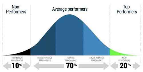
What you see is a continuous graph because it's dynamic, it fluctuates with new data coming in and out. It shows the highest point which has the highest probability of occurring. So with this graphic in mind, we can see that what we are about to learn is useful for statistical data to find out the top performers in some area.
Now to understand bell curve, you need to know about two metrics:
- Mean – the average value of all the data points
- Standard Deviation – it's how different the data is from the mean value, let's say you have 100 records with the mean is 50 but there is one value that is 10, the standard deviation is going to measure that.
To learn how to create it watch the video below, it'll be faster for you:
Formulas used in this video:
- To generate sample data:
=RANDARRAY([rows],[columns],[min],[max],[whole_number]) - To Generate data for the Bell Curve:
=NORM.INV (probability, mean, standard_dev)
With love and respect,
Arturo 👨🏻💻