In iOS 16, SwiftUI got a way to change the navigation bar color with the new modifier, .toolbarBackground
Basic usage
To change a navigation bar color in SwiftUI, you apply toolbarBackground modifier to the content view of NavigationStack.
NavigationView is deprecated in iOS 16.toolbarBackground accepts two parameters.
ShapeStyle: The style to display as the background of the bar.ToolbarPlacement: The bars to place the style in. Since we want to change the color for a navigation bar, we will set this to.navigationBar. Leaving this field empty will default to.automatic.
In this example, we set the navigation bar background color to pink.
struct ContentView: View {
    var body: some View {
        NavigationStack {
            List {
                Text("Hello, SwiftUI!")
            }
            .navigationTitle("Navigation Title")
            .toolbarBackground(
                .pink,
                for: .navigationBar)
        }
    }
}-
Coloris one of the shape styles, so we can use it as an argument. - We set
.navigationBarforToolbarPlacementto apply background color to the navigation bar.
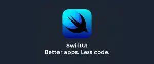
By default, the system background color will show/hide automatically based on the appearance of the content of a navigation view, e.g., List or ScrollView.
As you can see, for the .insetGrouped list style, the background of a navigation bar becomes invisible in an initial state.
Once we move the content up, the navigation bar becomes visible and shows the color that we set (pink).
We can override this behavior with another variation of .toolbarBackground, which accepts Visibility parameter.
Background visibility
To control background color visibility, we use another variation of .toolbarBackground modifier, which accepts Visibility instead of ShapeStyle.
Visibility controls the preferred visibility of the bar's background.
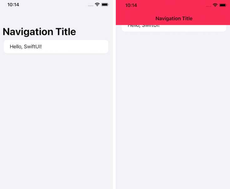
In this example, we force navigation bar color to always visible by set Visibility to .visible, .toolbarBackground(.visible, in: .navigationBar).
struct ContentView: View {
    var body: some View {
        NavigationStack {
            List {
                Text("Hello, SwiftUI!")
            }
            .navigationTitle("Navigation Title")
            .toolbarBackground(
                Color.pink,
                for: .navigationBar)
            .toolbarBackground(.visible, for: .navigationBar)

        }
    }
}
With this change, the navigation bar background color will always be present.
Title and status bar color
By default, a navigation title and status bar color will change according to the device's color scheme.
This might be a problem if you use a custom background color because it might not work well with black and white text.
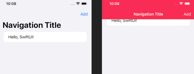
To change color for text in a navigation bar, we use the new modifier, .toolbarColorScheme. We specify the color scheme of the navigation bar's background color in .toolbarColorScheme.
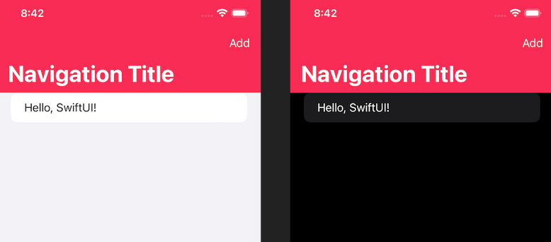
I specified .dark, which turns all text in the navigation bar white in the following example.
struct ContentView: View {
    var body: some View {
        NavigationStack {
            List {
                Text("Hello, SwiftUI!")
            }
            .navigationTitle("Navigation Title")
            .toolbar {
                Button("Add") {}
            }
            .toolbarColorScheme(.dark, in: .navigationBar)

            .toolbarBackground(
                Color.pink,
                for: .navigationBar)
            .toolbarBackground(.visible, for: .navigationBar)
        }
    }
}
Both title, status bar, and button (if you have one) will adapt to this change.
The color scheme will apply only when the background is shown.
So if you don't set .toolbarBackground(.visible, in: .navigationBar), this is the result you will get.
Toolbar items
SwiftUI’s toolbar() modifier lets us place bar button items anywhere in the top or bottom space, but only when our view is embedded inside a NavigationView.
If you want to place buttons into a toolbar at the bottom of the screen, use toolbar() then create a ToolbarItem with the placement of .bottomBar, like this:
NavigationView {
    Text("Hello, World!").padding()
        .navigationTitle("SwiftUI")
        .toolbar {
            ToolbarItem(placement: .principal) {
                Button("Press Me") {
                    print("Pressed")
                }
            }
        }
}
f you want to separate buttons inside a ToolbarItemGroup, add a spacer view wherever you want it. For example, this will place one button on the left edge of the toolbar, and one on the right edge:
NavigationView {
    Text("Hello, World!").padding()
        .navigationTitle("SwiftUI")
        .toolbar {
            ToolbarItemGroup(placement: .bottomBar) {
                Button("First") {
                    print("Pressed")
                }

                Spacer()

                Button("Second") {
                    print("Pressed")
                }
            }
        }
}