This is an up-to date documentation with examples on how to create buttons in SwiftUI. Target iOS is 15+
The basic structure of a Button is the following:
Button(action: {
    doSomething()
}) {
    Text("Road2Crypto")
}
Using Button Role
When it comes to style, you can either go fully granular style or use apple's predefined style for quicker development:
Button("Delete", role: .destructive) {
    viewModel.delete()
}
You can also add some background with:
Button("Delete", role: .destructive) {
    print("Delete")
}
.buttonStyle(.borderedProminent)
.controlSize(.large)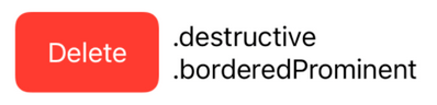
For a standard button, try:
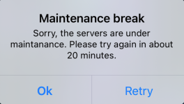
.alert("alertTitle", isPresented: $isMaintanaceModeEnable, actions: {
    Button("Retry", action: { })
    Button("Ok", role: .cancel, action: { })
}, message: {
    Text("alertDescription")
})
You could also place text fields, etc where the buttons are located.
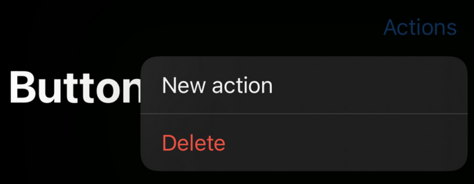
You can also add multiple options to a button like with:
struct ContentView: View {
    var body: some View {
        NavigationView {
            Text("Hello, World!")
                .toolbar {
                    Menu("Actions") {
                        Button("New action") {}
                        Button("Delete", role: .destructive) {}
                }
            }.navigationTitle("Buttons")
        }
    }
}
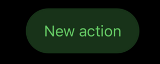
Apple gives a couple of options to design the button, you need to platy around with it to find the right spot, here's an example:
Button("New action") {}
    .tint(.green)
    .buttonStyle(.bordered)
    .buttonBorderShape(.capsule)
    .controlSize(.large)
Confirmation Dialog
Other than the new button style, iOS 15 comes with a new modifier called .confirmationDialog that you can attach to a Button for displaying a confirmation dialog.
struct DemoView: View {
@State private var isShowingDialog = false
var body: some View {
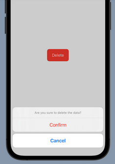
Button("Delete", role: .destructive) {
isShowingDialog = true
}
.buttonStyle(.borderedProminent)
.controlSize(.large)
.confirmationDialog("Are you sure to delete the data?", isPresented: $isShowingDialog, titleVisibility: .visible) {
Button("Confirm", role: .destructive) {
// Handle the delete action.
}
Button("Cancel", role: .cancel) {
}
}
}
}The .confirmationDialog modifier takes in a title and a binding to a Boolean value that determines whether to present the dialog. Optionally, you can indicate whether the dialog should display the title.
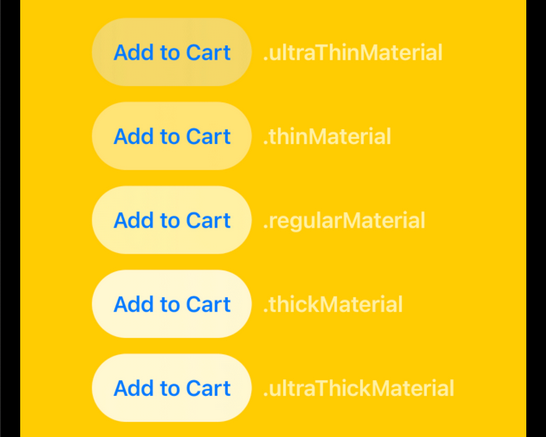
Customizing the Button with Materials
n iOS 15, SwiftUI introduces a material type for developers to create different types of blur effects. You can apply a blur effect to a view that appears behind another view by adding one of the following materials using the .background modifier:
- .ultraThickMaterial
- .thickMaterial
- .regularMaterial
- .thinMaterial
- .ultraThinMaterial
Here is the sample code snippet which applies the .ultraThinMaterial:
Button(action: {}) {
    Text("Add to Cart")
        .font(.headline)
}
.padding()
.background(.ultraThinMaterial, in: Capsule())
As explained by Apple, adding a material is like inserting a translucent layer between the modified view and its background. Depending on the material you use, it will achieve a different blur effect. The following figure demonstrates the blur effect of different materials.
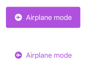
Toggle Button
Toggle in iOS appears in the form of switch. In iOS 15, you can configure a toggle to appear like a button by using the .toggleStyle modifier like this:
struct DemoView: View {
    @State private var isEnabled = false

    var body: some View {

        Toggle(isOn: $isEnabled) {
            Label("Airplane mode", systemImage: "airplane.circle.fill")
        }
        .padding()
        .tint(.purple)
        .controlSize(.large)
        .toggleStyle(.button)
    }
}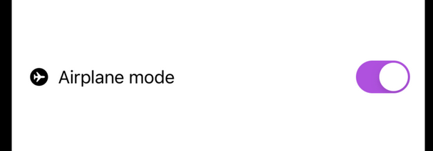
By setting the toggle style to .button, the toggle appears like a button. The figure below shows how it looks when the toggle is in ON/OFF state.